“The system was running slowly between about 9pm and 10pm last night. Do you know why?”
“Server A is due to be replaced soon. Is the current spec OK or should we change it?”
Both of those questions are reasonable ones to ask of a system administrator, but they’re not always easy to answer.
The first requires some historical information – things are (presumably) OK now, so what is different between now and late last night?
The second requires trend information. How has the use of server resources – disk space, memory, CPU and so on – changed over the past year or so?
Trend Monitoring
Trend information implies historical data, so in that respect the two questions require similar data. We may be monitoring our servers using Nagios or similar, but unless alerts were generated last night, Nagios won’t tell us why the server was apparently slow then. Unless Nagios has already made us aware of performance shortcomings, it won’t help us answer the second question, either.
As well as the almost real-time monitoring that Nagios and similar provides, it’s helpful to also graph some of the same parameters. At Tiger Computing, we currently use Munin for this. Again, other tools are available, but for the purposes of this article we’ll stick to Munin.
Out of the box there are a huge number of graphs available, and a couple of examples are shown below.
CPU Usage
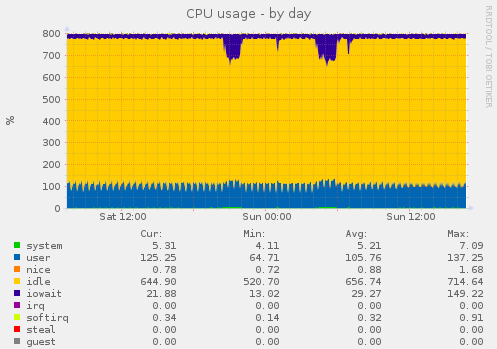
This first graph shows CPU usage. Note that the maximum CPU usage is 800%, which may seem odd, but that’s because this is a eight-core system and each core can run at up to 100%. This system is lightly loaded, with CPU activity rarely exceeding 120%.
As well as CPU activity, this graph also shows I/O wait time, represented by the purple area at the top of the graph. It can be seen that there is a spike in both CPU activity and I/O wait time between 9pm and 10pm, and again between 4am and 6am, which is when the system backups were run. Maybe that explains the perceived slower response last night?
Memory Usage
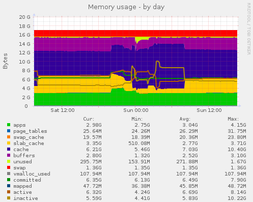
This second graph shows memory usage. There is a lot of information here, but note that a significant chunk of memory is being used as a disk cache (the dark blue area) to improve disk read times. At the top of the graph, the red area shows swap space used.
Munin in Everyday Use
Munin can be used to generate alerts and notifications, but we prefer to use (currently) Nagios for that role. Whereas we actively keep an eye on Nagios for alerts of developing issues, we don’t proactively monitor the Munin graphs as a matter of routine. Instead, we look at the Munin graphs in the context of solving a problem.
For example, we were alerted (by Nagios) to a system where the /home partition was 80% full. A quick investigation showed that the data taking up the space was simply data in user’s home directories, as might be expected. In this case, though, it can be helpful to understand the rate at which the partition is filling.
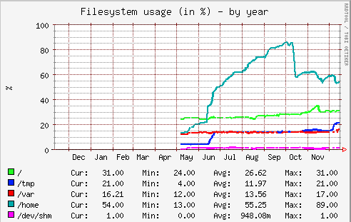
In the Munin graph of disk space used, shown above, the increase in disk usage is a steep but reasonably linear line. It’s easy to see that, if nothing is done, the /home partition will be full around the end of October. That information is invaluable for planning purposes – as well as knowing what the problem is, you also know how long you have to solve it.
In this particular case, it was easy to find one user who was using the vast majority of the space. Asking them to clean up their $HOME directory resolved the problem, as can be seen by the drop in mid-October of space used.
Hints and Tips
If you’re going to set up Munin on your servers – and you should – there are few things to be aware of.
- Use V2 (or later) of Munin. V2 was released back in 2012 and so is widely available, but if you do find yourself being offered V1, do try to use a later version. V2 is more efficient and also ships with many more plugins (ie, is able to monitor more parameters).
- It’s not difficult to write your own plugins if you want to monitor something that the (pretty comprehensive) shipped plugins don’t cover.
- Set up Munin to generate the graphs on demand. Historically, Munin generated the graphs from a
cronjob. The advantage was that the page that displayed the graphs rendered almost instantaneously, but generating those graphs is expensive. Given that they are rarely looked at, the short delay in generating them on demand is a price worth paying. - If you’re monitoring lots of servers, particularly if they do not routinely have web server software installed, consider having a central Munin server. Munin can work in a client/server configuration, with a central server collating and graphing the data from multiple client servers.
Could This Linux Tip Be Improved?
Let us know in the comments below.